.webp)
At WeeFin, we have always believed that good data alone is not enough. What matters is what you can do with it, how quickly you can understand it, explain it, and act on it. That is why we keep investing in making the platform not just more powerful, but more visual. Our latest updates to the Analytics capabilities are a direct result of listening to your feedback, and they mark a meaningful step forward in how ESG analysis gets done on the platform.
If you are an ESG analyst, you know the drill. You spend hours navigating between your platform, your spreadsheets, and your reporting tools, copying data, building pivot tables, calculating impacts by hand, and trying to piece together a story from rows and columns of data.
You need to explain why a portfolio's carbon score went up last quarter. You need to show regulators and clients that you are not just reporting a number, but that you actually understand what is behind it. You need to track progress over time, benchmark against a universe, and present all of this in a way that makes sense to people who are not living in the data every day.
Traditional ESG tools were not built for this. That changes now with the new WeeFin analytics capabilities.
You can now reorganise your global portfolio view directly on the platform. Drag and drop columns, group your data by sector, country, asset type, or any other dimension you care about, without exporting anything. What used to take 20 minutes now takes seconds, and your data is always synced and updated with the ESG Golden Source. This is already live for all users with the Fund Aggregation capabilities.
Any table you configured can now be turned into a graph instantly. Bar charts, trend lines, portfolio breakdowns, generated directly from your table. You can then export them for your reports or client presentations without leaving the platform. No more copy-pasting charts from spreadsheets, no more reformatting for every presentation. Just your data, made visual, in a few clicks. Also already live for users with the Fund Aggregation capabilities.
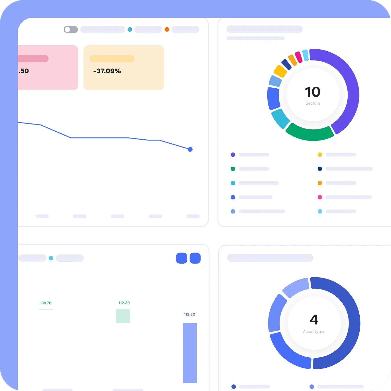
This is the big one. We are launching a new service called Analytics KPI Dashboards, part of the Oversight & Control module, designed to change how you monitor your ESG data over time. Instead of rebuilding your analysis from scratch every time you need to check in on your key indicators, you save it once as a dashboard. It updates automatically at every data ingestion. You can share it with your team, and come back to it whenever you need, without any manual work.
These updates were built from real feedback from real analysts. If there is a workflow that still feels painful, a view you wish you had, or a feature you think would change how your team works, we want to know. Please reach out to your Customer Success Manager if you have any feedback/question or if you would love to test the new features. Every message gets read, and the best ideas end up on the roadmap.